Learning Outcome 3
Professional Design Tool Proficiency and Iterative Visual Design
Design Tools Mastery
I used a range of creative tools throughout this coursework. The two main ones were Adobe Photoshop and After Effects. These were the core programs I relied on to develop the visual elements of the project. I also used Lightshot to capture quick screenshots for documenting my process and progress.
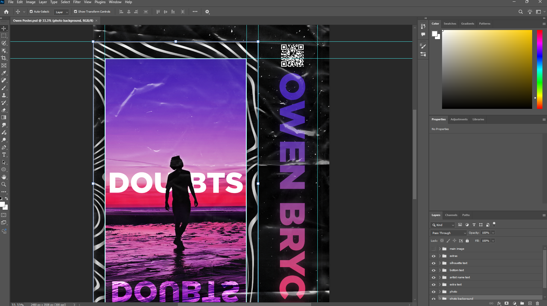
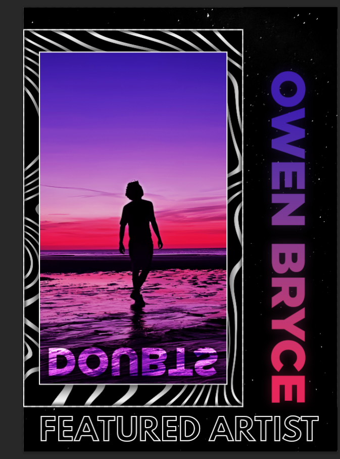
I began by creating the main artwork in Photoshop. This design was made to represent Owen Bryce's brand and his track "Doubts." The final result takes the form of a stylized poster. It features bold typography, vivid gradients, and layered visuals. I chose these elements to reflect the mood and tone of the music. The silhouette and mirrored text create a sense of reflection and uncertainty, which ties in with the song's theme.
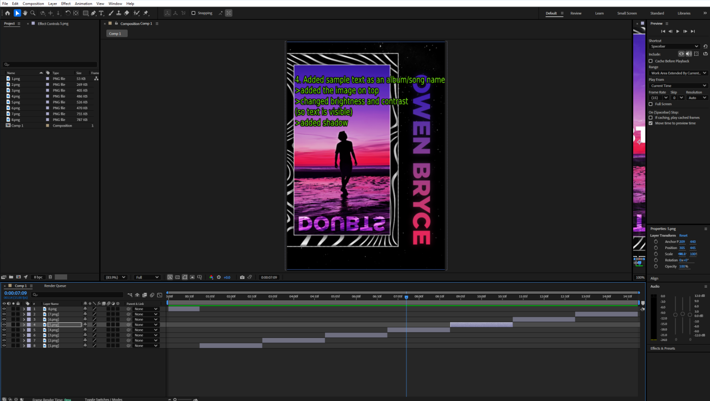
After completing the poster, I moved on to create a GIF using After Effects. The purpose of the GIF was to show how the artwork came together step by step. It also gave me the opportunity to visually explain some of the techniques and effects I applied. The animation highlights each phase of the design process, from layout and color grading to text placement and finishing touches.
I decided to use Photoshop and After Effects because they allow for a high level of creative control. They're tools I'm confident working with, and they give me the flexibility to experiment while maintaining quality. Using them helped me produce a professional-looking outcome, while also allowing me to clearly present the journey behind the final design.
Photoshop Workflow
After Effects techniques
After Effects settings
Design Iterations Journey And Design Case Study
Creating the artwork in Photoshop involved several key stages. At first, I considered making a wallpaper or profile picture. However, I later decided that a poster-style design would be more effective. Since Owen is an artist, a poster felt like a better way to showcase his identity and promote his brand visually.
Here are the steps I followed:
Step 1: Research
I began by researching how different artists present themselves visually. I looked at various posters and social media graphics to understand how artists communicate their style and personality to their audience. This gave me a sense of common design choices, such as layout, color schemes, and typography.
Step 2: Tool Selection
Next, I had to choose which software to use for the design. I initially considered simple tools like Paint or online editors such as Photopea, which has a similar interface to Photoshop. However, I ultimately decided on Photoshop. It offered more advanced features and allowed me to create a cleaner, more professional-looking poster.
Step 3: Resolution Selection
Choosing the right resolution was important for image quality. I experimented with different sizes and formats. After some testing, I settled on A4 dimensions (2480 x 3508 pixels), which is a standard and versatile size for posters.
Step 4: Design Process
I started with a rough prototype inspired by posters I had seen during my research. This initial sketch helped guide the layout and visual direction. Once that was in place, I began collecting high-quality images that would enhance the design. I incorporated various visual effects to make the piece more engaging and visually appealing.
The GIF below demonstrates the full process step by step. It also includes details about the main techniques I used throughout the creation of the artwork.
Step 5: Challenges Faced and Solutions
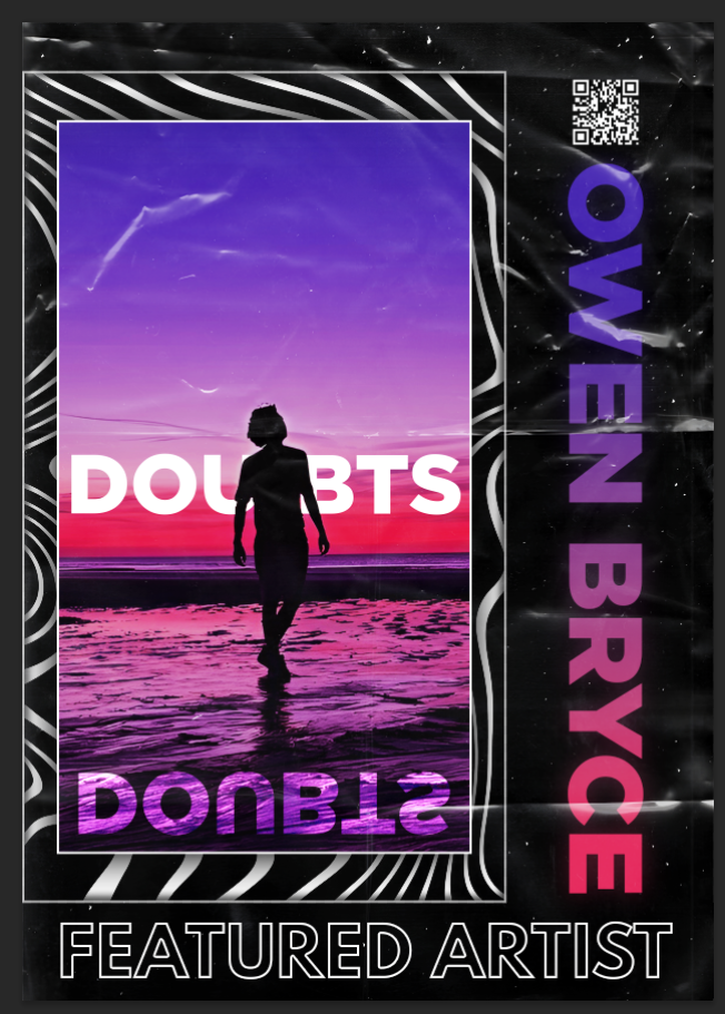
During the design process, I ran into a few challenges that pushed me to make creative adjustments. One of the first issues was getting the main text, "DOUBTS," to stand out clearly. The background was bright and colorful, which made the white text hard to read at times. I didn't want to dull the image too much, so I had to find a balance. I solved this by adding a soft drop shadow behind the text. I also adjusted the contrast in the background slightly. This made the text pop without taking away from the sky and sunset.
Another challenge came from the mirrored reflection of the text. At first, it looked too sharp and out of place. It didn't blend well with the sand and water. To fix this, I used Photoshop to add a subtle distortion to the reflection. I also faded the bottom part using a gradient mask. These changes helped it look more realistic and better integrated with the scene.
Color grading was another area that took some trial and error. Early versions of the poster had colors that felt too flat or didn't match the mood of the track. I wanted the visuals to reflect the emotional tone of the music. Eventually, I created a custom gradient with purples, pinks, and deep blues. This gave the design more depth and tied it to the theme of self-doubt and reflection.
Even though these challenges weren't major, they made a big difference in the final result. Solving them helped me improve the clarity, realism, and emotional impact of the artwork.
Design Process Gallery
A visual journey through the creation of Owen Bryce's promotional artwork
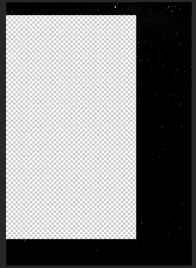
Step 1: Creating the Background
I started by setting up the poster’s background using a high-quality PNG of a night sky.
The dark, starry backdrop provided a moody and atmospheric foundation for the design.
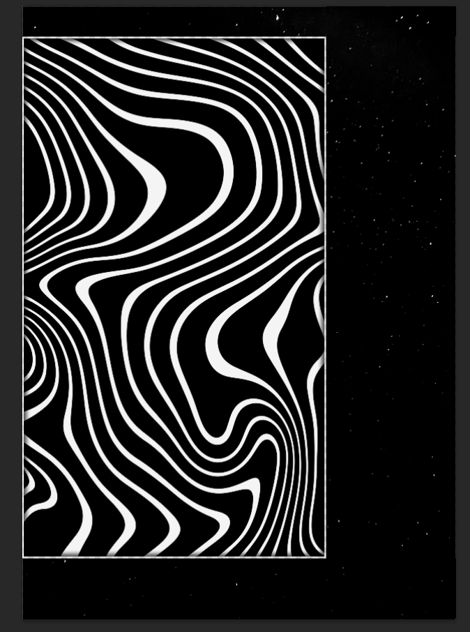
Step 2: Adding a Background Pattern
To enhance the visual depth, I layered a decorative pattern over the night sky—similar to the artwork style often seen in PewDiePie’s designs.
I converted the pattern to black and white for better contrast, then added a subtle border and an inner shadow to give it a slightly raised, textured effect.
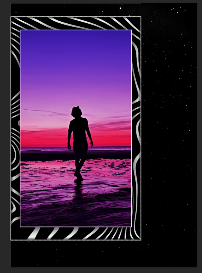
Step 3: Incorporating Owen’s Image
Next, I placed Owen’s image onto the poster. I applied color correction to ensure it matched the overall tone, then framed it with a clean border.
To make it stand out, I added a soft drop shadow beneath the image, creating a sense of depth.
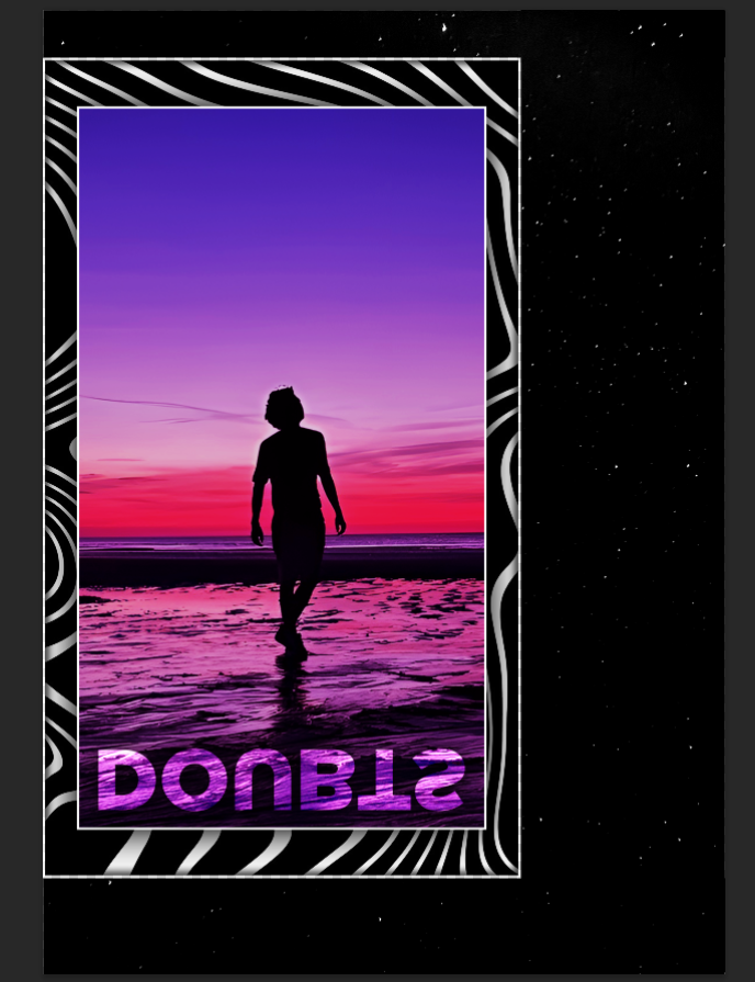
Step 4: Adding Sample Text (Album/Song Name)
I inserted placeholder text for the album or song name, positioning it prominently. To ensure readability against the background, I adjusted the brightness and contrast of the underlying elements.
Finally, I applied a shadow effect to the text to make it pop.
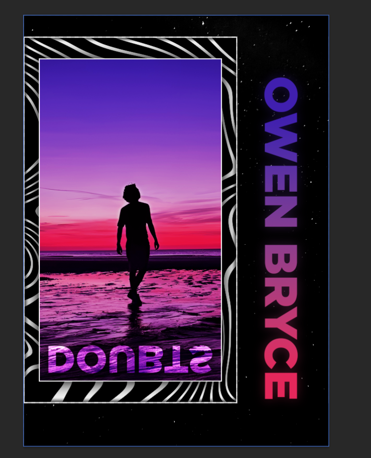
Step 5: Incorporating the Name Text
For the main name text, I designed a gradient that complemented the poster’s color scheme and applied it over the letters.
To create a glowing effect, I duplicated the text layer, applied a Gaussian blur, and placed it beneath the original text for a soft, luminous outline.
Step 6: Adding Outlined Text
I included additional text with a bold, clean look—black letters with a crisp white stroke.
This high-contrast treatment ensured legibility while maintaining a sleek aesthetic.
Step 7: Final Decorative Touches
To fill empty space and add functionality, I placed a QR code with a drop shadow to ensure visibility.
Lastly, I overlaid a subtle texture to give the poster a slightly worn, vintage feel, enhancing its visual appeal.

Steps Explained
Here's a brief breakdown of each individual step.
Visual Design Principles
For this artwork, I started with a simple photo of a person walking on the beach at sunset. I wanted to create a mood around the image. So I focused on the use of color. I chose deep blues, purples, pinks, and reds—colors that blend well but also feel emotional. The reflection in the wet sand gave the image a natural symmetry. I emphasized that to show a sense of duality and self-reflection. To hold everything together, I added black borders and soft, flowing lines. These help guide the eye and keep the design balanced.
Typography played a big role in building the message. I used a bold, clean sans-serif font for the title "DOUBTS." I placed it clearly across the center of the artwork. Then I added a mirrored version of the word below it. This reflection represents uncertainty and inner conflict. I placed the artist's name, "OWEN BRYCE," vertically on the side. I used a color gradient that goes from purple to pink, matching the background. At the bottom, I added "FEATURED ARTIST" in all caps and white text. This gave the artwork a clear, poster-like look.
I kept the layout simple but strong. I followed the rule of thirds to position the figure and the horizon. This helps the viewer's eye move naturally through the design. I included a small QR code in the top corner as a modern detail. To finish it off, I added film grain and paper crease textures. These give the artwork a raw, real-world feel. My goal was to turn a calm scene into something expressive. It looks like a poster but also feels personal and emotional.
INTRODUCTION TO SECTION 2
For this project, I created a piece of artwork to promote music by an indie artist. My goal was to mix creativity with design tools to make something that looks good and feels personal. I wanted the final design to connect with people emotionally and be useful in real situations—like sharing music or posting on social media.
I try to always design with the user in mind. That means I think about what the client or audience needs. In this case, I was working with a musician, so I made sure the artwork matched his style. I used tools like Photoshop and After Effects to bring the design to life. I also stayed flexible and open to feedback so I could make changes if needed.
User-Centered Design Process
User Research
Before I began designing, I spent time thinking about the audience. Owen is an indie pop artist, and his fans likely enjoy personal, creative, and emotional content. I looked at how other artists promote their work. I explored posters, music covers, and Instagram posts. This helped guide my choices in style and tone.
Wireframes & Prototypes
To start, I made a basic sketch of the poster layout. Then I created a first version using Photoshop. I used placeholder images and text to test ideas. I tried out different colours and layouts to match the feeling of Owen's music and personality.
User Testing
Once I finished the artwork, I showed it to Owen and asked for feedback. He was really happy with how it looked. He liked the colours, the mood, and the reflection effect under the title. He said it felt like it matched his music. He didn't want to make any changes. That told me the design was working well and didn't need to be fixed
Interactive Features Showcase
I wanted to go further than just showing the final design. So I made a short animation in After Effects. It shows the design step-by-step. It starts with the background and builds up with each layer until the full poster is finished.
This makes the design process more interesting to watch. It helps people understand how I made it. It also adds some movement and personality to the project, which can be useful when showing it in a portfolio.
To make the animation, I used tools like keyframes, masks, and colour effects. These added motion and helped bring more life to the work, without making it too busy or distracting.
Stakeholder Communication
Talking with the artist was an important part of the project. After I finished the artwork, I sent it to Owen. I told him it could be used to promote a song or anything else he had in mind. I also said I was happy to change things if needed.
He replied and said he really liked it. He thought the colours and mood were a good fit for his music. He also pointed out the reflection under the title and said it was a nice touch. He didn't want to change anything, which meant he was satisfied with the result.
I kept the message friendly and clear. I made sure he felt comfortable giving honest feedback. That helped build trust and made the work feel more like a shared effort.
Design Case Study
Problem Statement:
Owen needed artwork to support his music and build his image. As an indie pop artist, his songs are often emotional and creative. The design needed to show those same ideas through colour and layout.
Solution Approach:
I researched what other artists do. Then I designed a poster in Photoshop. I used strong colours, a silhouette, and a reflection to match the style of his music. After that, I made a short animation in After Effects to show how the design came together.
User Testing:
I shared the final design with Owen and asked for his thoughts. He was happy with how it looked. He liked the mood and style. He said it didn't need any changes, which told me it worked well.
Outcome:
The artwork gave Owen something he could use to promote his music. It matched his brand and felt personal. I also learned a lot during the process—like how to communicate well, tell a story through visuals, and keep my design flexible. The animation helped me show my creative process and made the project feel more complete.
Learning Outcomes
Outcomes
These learning outcomes represent key skills and competencies developed throughout my web development education and professional experiences.
LO 1
Mastered front-end web development fundamentals including HTML5, CSS3, and JavaScript to create responsive and accessible user interfaces.
LO 2
Developed proficiency in modern frameworks like React.js to build dynamic, interactive web applications with efficient state management.
LO 4
Practiced user-centered design principles and created wireframes and prototypes that prioritize intuitive user experiences.
LO 5
Applied version control with Git and collaborated effectively in team environments to deliver complex web projects on schedule.